I am the ghost of groovymother.com. Woooooo!
This is an old page from Rod Begbie's blog.
It only exists in an attempt to prevent linkrot. No new content will be added to this site, and links and images are liable to be broken. Check out begbie.com to find where I'm posting stuff these days.
Filed under 'visualization'
➠ January 24, 2011
Trulia - Rent vs. Buy Index (Q1 2011)
The first fruit of the purchase of Movity by Trulia: Visualization of the cities in the US where it makes more sense to rent than to purchase (unsurprisingly, SF falls into this category)
InMaps - Visualize your LinkedIn network
This is just lovely. Visualization of your LinkedIn graph, auto sorted into clusters. Interesting to see that, for example, my SF (pale blue) and Boston (purple) non-co-worker geek friends were easily filtered from each other.
➠ November 22, 2010
Mashup Breakdown - Girl Talk - All Day
Visualization of the samples on the new Girl Talk album. Amazing!
➠ July 1, 2010
How Mariano Rivera Dominates Hitters
Lovely vid from the NYT. As a Sox fan, I loathe Mariano Rivera, for he is so damned good.
➠ June 7, 2010
If San Francisco Crime was Elevation
You’d get out of breath walking up Tenderloin Mountain. Fun visualization.
➠ June 2, 2010
Slide’s Code: 2004-2010
Inspired by Daniel Bogan's visualization of the Flickr codebase (http://vimeo.com/11876335), I pulled together this view of Slide's code repository since the first commit on 01-Sep-2004.
Branches are directories, blobs are files (coloured by file type -- swfs are green, python is pale blue, etc), and the buzzing-around things are committers.
Built using Gource - http://code.google.com/p/gource/
➠ June 1, 2010
In Perspective: Visualizing the BP Oil Disaster
Move the BP oil spill close to geography you know to gain perspective on its size.
➠ May 21, 2010
Flickr/Gource
Seven years of Flickr source control, visualized. I think I would make my laptop weep if I attempted to run gource against the (16 gigabyte!) Slide git repo.
➠ September 14, 2009
➠ August 8, 2009
➠ August 2, 2009
How Different Groups Spend Their Day
Outstanding interactive infographic from the New York Times. Data from the Bureau of Labor Statistics on how Americans spend their time, sliceable by demographic sectors.
➠ December 20, 2008
➠ November 9, 2008
2008 Electoral Cartograms
Remoulding the US electoral map based upon population, rather than geographic, size.
➠ October 16, 2008
Lexical Analysis of 2008 US Presidential and Vice-Presidiential Debates - Who's the Windbag?
All manner of interesting statistics and visualizations drawn out of the presidential debate transcripts.
➠ July 14, 2008
RA DIOHEA_D / HOU SE OF_C ARDS - Google Code
New Radiohead video was shot without cameras, instead using lasers to get 3D data which was visualized. Chunks of the data are available from Google, so you can have a go at processing it yourself.
➠ July 10, 2008
Zoomii.com - The "Real" Online Bookstore
Whizzy Amazon-browsing UI, for those who like to judge books by their covers.
➠ June 30, 2008
➠ June 29, 2008
What I’ve been listening to
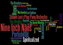
My last three months worth of listening. Generated with last.fm data and Wordle.
➠ June 23, 2008
Facebook Map
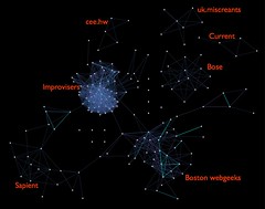
My Facebook friends, mapped out using the Nexus app.
Major constellations are marked -- improvisers sure like their own, huh?
➠ May 26, 2008
LastGraph3
The last.fm music visualizer just upped the awesome a tad. I love the “posters” showing your artist preferences over time.
➠ May 21, 2008
Spectra Visual Newsreader | msnbc.com
Interesting attempt by MSNBC to visualize (their own) RSS feeds.
➠ May 8, 2008
Processing.js
John Resig has ported the Processing visualization language to JavaScript, using the <canvas> tag. John is officially one of the most scary-smart people I know.
➠ March 25, 2008
mail-trends
Analyzes your email corpus and displays nice graphs. Currently only works with GMail, but support for all IMAP servers is planned.
➠ June 1, 2007
LastGraph: Welcome
Renderer for that awesome squiggly last.fm-over-time visualization I posted a couple of weeks ago. Very excited to see my results from this!
➠ May 4, 2007
What have I been listening to?
Gorgeous visualization of a year’s worth of music listening. Hey! Last.FM! I would pay $50 in a heartbeat for a nice poster print of this with my own listening habits.
➠ April 19, 2007
disinfographics (tecznotes)
The highlights of Don Hincliffe’s loony “info” graphics which “explain” Web 2.0. I think my favourite is “The Habits of Highly Effective Web 2.0 Sites”. It’s gorgeously demented.
➠ March 29, 2007
KOKOGIAK - All (known) Bodies in the Solar System Larger than 200 Miles in Diameter
Cool photomontage from Alan Taylor.
➠ December 16, 2006
TuneGlue | Relationship Explorer
Yet another Flash musicmap explorer. This one’s from EMI and uses Last.fm relationship data.
➠ November 29, 2006
➠ November 28, 2006
Kunal Anand - Blog: Glancing alternative song structures with Graphviz
Visualizing the structure of a song, based on the pattern of words used in the lyrics.
➠ October 27, 2006
whitney music box
Trippy flash “music box”. With some chemicals, this could make for hours of entertainment.
➠ October 10, 2006
My last.fm chart arcs

Funky visualization of my music listening over time from MartinD at last.fm. Read his explanation to understand what it means, or just enjoy the soothing colours.
➠ August 15, 2006
➠ July 3, 2006
About This Site
This is an archive of groovmother.com, the old blog run by Rod Begbie — A Scottish geek who lives in San Francisco, CA.
I'm the co-founder of Sōsh, your handy-dandy guide for things to do in San Francisco this weekend.