I am the ghost of groovymother.com. Woooooo!
This is an old page from Rod Begbie's blog.
It only exists in an attempt to prevent linkrot. No new content will be added to this site, and links and images are liable to be broken. Check out begbie.com to find where I'm posting stuff these days.
Filed under 'design'
➠ April 10, 2012
Getting Clients
Sample chapter from Mike Monteiro’s new book, Design is a Job.
I’m not a designer, but I love working with them, and have a client services past as an engineer. Tons of great insights in the three chapters I’ve read so far.
“Get to know the people on the client team and treat them well. Make them a valuable part of the project and make sure their voices get heard. People change jobs. If the current project goes well, the person who hired you will have her stock rise within the company, and the rest of the staff will eventually spread out far and wide to other companies who will need design services at some point. Your DNA travels with them. (Not literally. I’m hoping I don’t need to add a chapter explaining that.)”
➠ March 19, 2012
Frustro: The Impossible Typeface
Font inspired by the penrose triangle. More typefaces should make your brain hurt.
➠ September 19, 2011
➠ December 1, 2010
➠ November 15, 2010
➠ September 21, 2010
Etch A Sketch iPad Case
Nice! I like the idea of rebooting your iPad by holding it upside down and shaking.
➠ September 15, 2010
calvetica - The fast calendar for iPhone
I am digging the heck out of this. A lovingly-designed calendar app replacement for the iPhone which interacts with your existing calendars, so all the lovely syncing goodness of iOS keeps on working.
➠ August 12, 2010
Tips On Buying Design
Fab essay by Mike Monteiro.
“It’s like buying a melon. Any sample the grocer is handing out won’t come from the melon you’re about to buy. And don’t buy on looks. To really know a melon you’ve got to squeeze it hard at the ends. Also, a melon analogy? Not my best moment. Let’s move on”
➠ July 17, 2010
iFontMaker – The First & Fastest Font Editor for iPad
Super-simple typeface designer for iPad. Touch interface to sketch your font, then it uploads it to a website for sharing.
➠ July 5, 2010
iBooks highlighting
Jeez, even the text highlighting is gorgeous and magical! (Quote from Richard Herring's How Not to Grow Up)
➠ June 22, 2010
ALT/1977: WE ARE NOT TIME TRAVELERS
“I’ve re-imagined four common products from 2010 as if they were designed in 1977: an mp3 player, a laptop, a mobile phone and a handheld video game system. I then created a series of fictitious but stylistically accurate print ads to market them, as well as a handful of abstract posters (you know, just for funsies).” Wonderful!
➠ June 9, 2010
Today's Guardian (Phil Gyford's website)
Phil explains some of the design decisions behind his reader webapp.
➠ April 16, 2010
Phaidon Design Classics for iPad
The content of the $175 hardcover books that I’ve been coveting for years are available as a $20 iPad app? Sold!
➠ April 2, 2010
Popular Science+
One of the things that most excites me about the iPad is getting to read magazines without that deadtree cluttering up our house. BERG have worked with Popular Science to create the first compelling iPad magazine. Can’t wait to see what other publishers do.
➠ February 23, 2010
➠ January 21, 2010
thesixtyone
Gorgeous redesign of the indiemusic exploration and listening site.
➠ January 7, 2010
Letterheady
I don’t know why letterhead design interests me as much as it does, but I’m always fascinated by it. Random fact: As a kid, I collected “With Compliments” slips.
➠ December 10, 2009
➠ October 23, 2009
➠ October 6, 2009
New Dr Who Logo
Love love LOVE! the new Doctor Who logo. As timeless as is appropriate for a show about time travel.
➠ April 26, 2009
The extreme Google brain
A beautifully incendiary post about “Google’s Aspergerian nerds” and their complete misunderstanding of visual design.
➠ March 24, 2009
➠ February 10, 2009
➠ December 28, 2008
Brand New: Best & Worst 2008
The best and worst logo redesigns of 2008. I quite like their April 1st Ford redesign — wish it had been for reals!
➠ November 26, 2008
Helvetireader
Rather gorgeous minimalistic skin for Google Reader, by Jon Hicks. Had to tweak it to get my all-important “Mark All as Read” button, but apart from that, perfet.
➠ November 16, 2008
➠ October 10, 2008
30 Reasons
“30 graphic designers create 30 posters and give you their 30 reasons to vote for Barack Obama on November 4th.”
➠ August 20, 2008
Stevey's Blog Rants: Business Requirements are Bullshit
“ONLY BUILD STUFF FOR YOURSELF. That’s the Golden Rule of Building Stuff. If you’re planning to build something for someone else, let someone else build it.”
➠ July 28, 2008
It's 1975 And This Man Is About To Show You The Future
Slides from a vintage IBM sales presentation. I might do a presentation some time that *only* uses these for illustration.
➠ July 27, 2008
I believe that is meant to say “fuel”
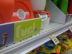
but that's not what I saw when it caught my eye in the supermarket. This is what happens when your designer doesn't give a, ahem, "fuel".
➠ June 6, 2008
That design is money!
About the UI design of Wells Fargo ATMs. My decision to open a Wells Fargo account after moving to SF was largely influenced by the experience I had at one of their ATMs, so it’s definitely a good design.
➠ May 27, 2008
COLOURlovers :: Patterns
ColourLovers has a new (to me) section collecting tileable patterns. Some gorgeous designs here — just the thing for your wallpaper.
➠ April 27, 2008
Creative Review: Spiritualized and Farrow: made for each other
Interview with Jason Spaceman and Mark Farrow about the fantastic packaging they’ve put together for Spiritualized’s albums. They’re one of the few bands where I make sure to buy the “deluxe” CD.
➠ April 2, 2008
➠ March 3, 2008
Coding Horror: Actual Performance, Perceived Performance
The way you code a progress bar will do more to “performance” than tweaking the process it’s measuring. “Humans do not perceive the passage of time in a linear way.”
➠ February 12, 2008
18 Smokin' Hot Business Card Designs
Varied mix of designs for business cards, plus links to suggestions for what to put on them. Spurred me on to creating something nicer than Moo Cards for when I’m attempting to be “professional”.
➠ January 31, 2008
Windows Vista Help: Opening the Windows Vista box
Official Microsoft documentation on how to open the Vista packaging. Because it *needs* documentation.
➠ January 29, 2008
➠ January 16, 2008
➠ January 14, 2008
Jellyvision: The Jack Principles
“The Jack Principles is the first set of comprehensive guidelines for designing, writing and performing for an interactive conversation.” Great reading if you’re developing software for humans.
➠ November 19, 2007
Reading Tea Leaves and Campaign Logos - The New York Times > Opinion
Analyzing the design details of the 2008 political campaign logos.
➠ October 23, 2007
Dopplr Blog > In rainbows
Lovely little design detail on Dopplr — Their “logo” changes colour based upon your usage of the site.
➠ October 10, 2007
Cover art for In Rainbows // journal // hicksdesign
Since the MP3s don’t have any cover-art, Jon Hicks is hosting a “Design your own Radiohead Cover Art” contest. #21 is my favourite so far.
➠ October 8, 2007
➠ August 30, 2007
➠ April 16, 2007
➠ April 6, 2007
➠ March 20, 2007
Google Homepage introduces dynamic themes - Download Squad
The new Google personalised homepage themes are gorgeous. Updating them based upon time and local weather is just ridiculously lovely!
➠ February 20, 2007
Tantek's Thoughts: Three Hypotheses of Human Interface Design
Nothing earth-shattering or new, but food for thought.
➠ February 9, 2007
The User Interface of Microformat Detection
Some very clever ideas about visually alerting users to the existence of microformats on a web page, plus some interesting debate in the comments about how much Firefox should visually change the look of a page in the name of “usability”.
➠ January 5, 2007
New at Pentagram: New Work: Saks Fifth Avenue
Saks Fifth Avenue’s new branding is defined by taking their logo, splitting it up into 64 squares, then tiling those squares in an almost random manner.
➠ December 26, 2006
➠ December 12, 2006
➠ December 7, 2006
BS 1363 - Wikipedia, the free encyclopedia
The awesomeness that *is* the British 3-Pin Plug. The article covers most of the beautiful design decisions, such as the longer earth pin (so earth is the first connection made when you plug it in) and the cable being attached to the bottom, so you’re less tempted to pull the plug by yanking the cord. Well done British Standards chaps!
➠ November 21, 2006
Joel on Software: Choices = Headaches
Good article by Joel — Why *does* the Vista shutdown menu require *seven* options?
➠ July 4, 2006
➠ June 17, 2006
➠ September 9, 2005
About This Site
This is an archive of groovmother.com, the old blog run by Rod Begbie — A Scottish geek who lives in San Francisco, CA.
I'm the co-founder of Sōsh, your handy-dandy guide for things to do in San Francisco this weekend.